
Color Theory and Quilt Background Color Selection
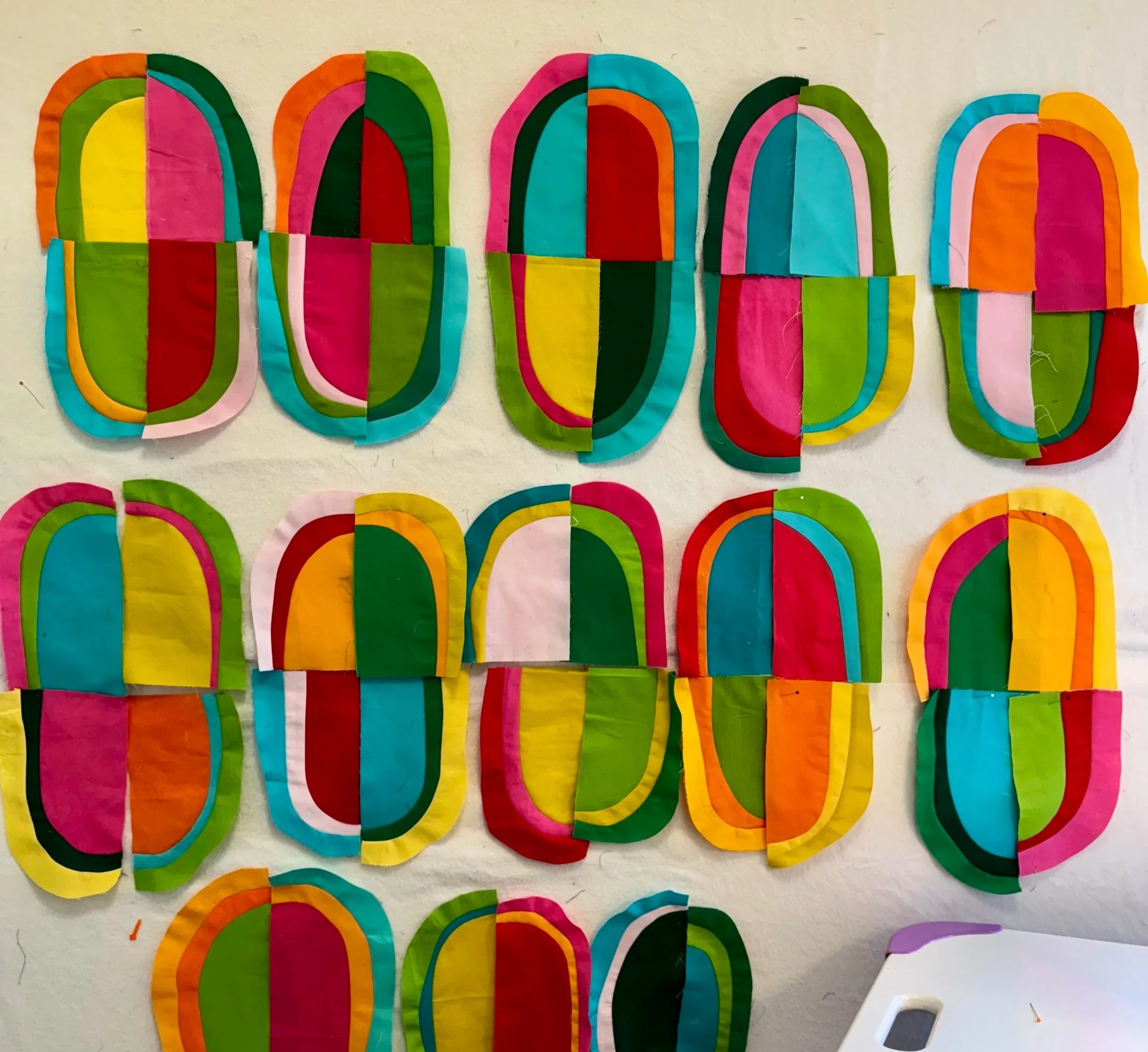
Work in Progress - curved motifs on the design wall
Here’s a deeper look into my design process—one you may find useful if you’ve ever felt stalled when selecting colors for a quilt.
“Figure-ground is the visual relationship between a composition’s foreground and background, between the object and the space it occupies” [source: quizlet.com]
In many traditional quilt designs built from repeated blocks, a motif naturally reads as the foreground, while a single—often neutral—fabric functions as the background or negative space. While this convention doesn’t apply to all of my work as a modern, improvisational quilter, there are times when a clear relationship between foreground and background emerges. That’s the case with this quilt in progress. As I pieced these motifs together, I had a fairly clear vision: I imagined them set against a neutral grey background. From years of hands-on experience and study of color theory, I know that a mid-toned grey can support colorful motifs without competing with them. Unlike white, which can wash colors out, or black, which can create high contrast and visual drama, a mid-tone grey tends to allow colors to relate to one another more naturally.
The Auditioning Process
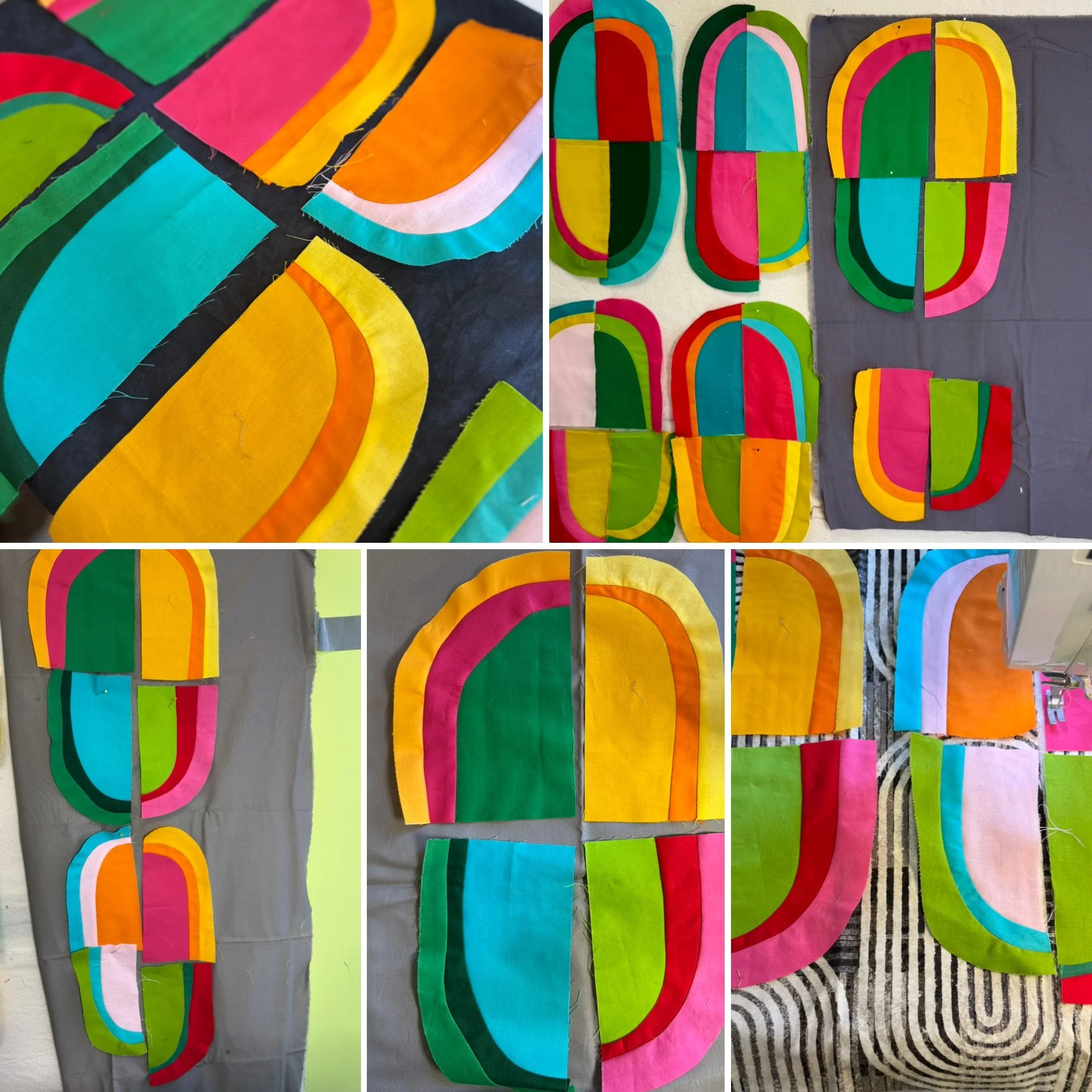
Background auditioning process
I began by auditioning fabrics from my stash—several neutrals and even a print—placing them behind the motifs on my design wall. Through this process, I confirmed that I preferred a mid- to dark-toned grey with a warm undertone. However, I didn’t have nearly enough yardage of any single fabric, which meant I needed to consider my next steps: purchasing additional fabric, hand-dyeing yardage, or using a range of fabrics to introduce another design element into the background.
Using Pre-Visualization Tools
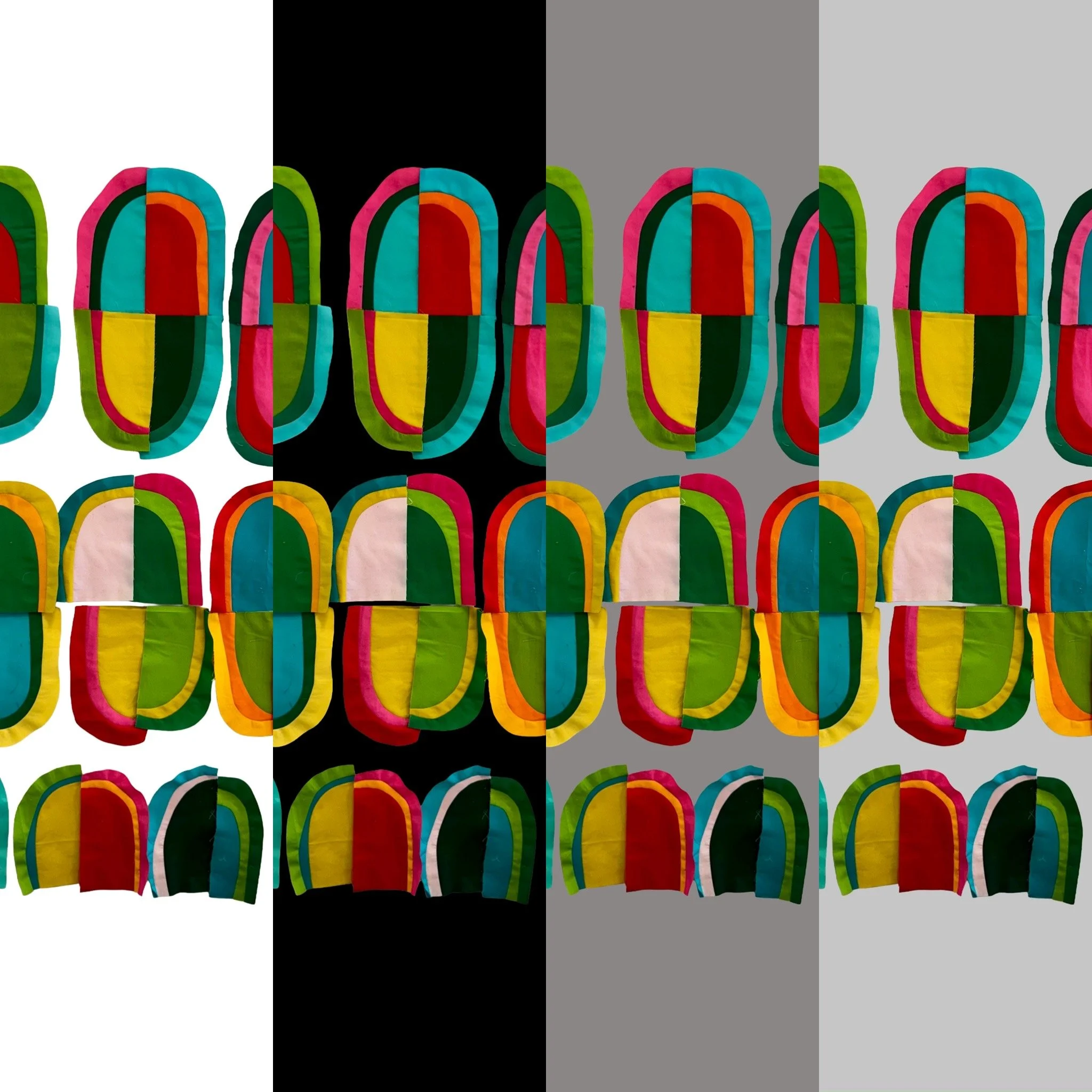
Mock-up using Adobe Express
Before committing to a direction, I turned to a pre-visualization tool. I took a photo of the blocks on my design wall and imported it into Adobe Express (the free iPhone app). Using the background-removal feature, I isolated the motifs and experimented with different background colors. Adobe Express offers a preset palette, and each color can be further customized. If you have a Hex or RGB code—for example, from a fabric line—you can create a color that closely approximates it.
For my purposes, I created separate mockups with white, light grey, medium grey, and black, then combined them into a single composite image for comparison.
As expected,
The black background was dramatic, but far too stark for my vision,
The light grey felt pleasant, but somewhat bland,
The medium grey—leaning toward a darker mid-tone—made the motifs feel lively, colorful, and balanced.
A Quick Color Theory Sidebar

Rhapsody in Blue, 2019
These observations echo points I share in my Color Stories Lecture, using my quilt Rhapsody in Blue as an example:
A black background pushes colors forward and makes them appear brighter.
A mid-tone grey shows colors in accurate relationship to one another.
A white background tends to wash out colors; motifs on white can appear smaller or farther away.

I selected the black background as I wanted the injection of energy and drama of the colored stripes floating against a dark backdrop.
Back to Improv
Pre-visualization tools—photographs, mockups, and editing apps—are incredibly helpful for getting into the right ballpark. But ultimately, there’s a moment when you need to choose a direction and begin. At this stage, I don’t yet know how these motifs will be arranged, or whether the background will remain simple or become more complex.
My best decisions tend to happen once I start sewing, adding pieces to the design wall, and allowing the improvisational process to guide the next step.
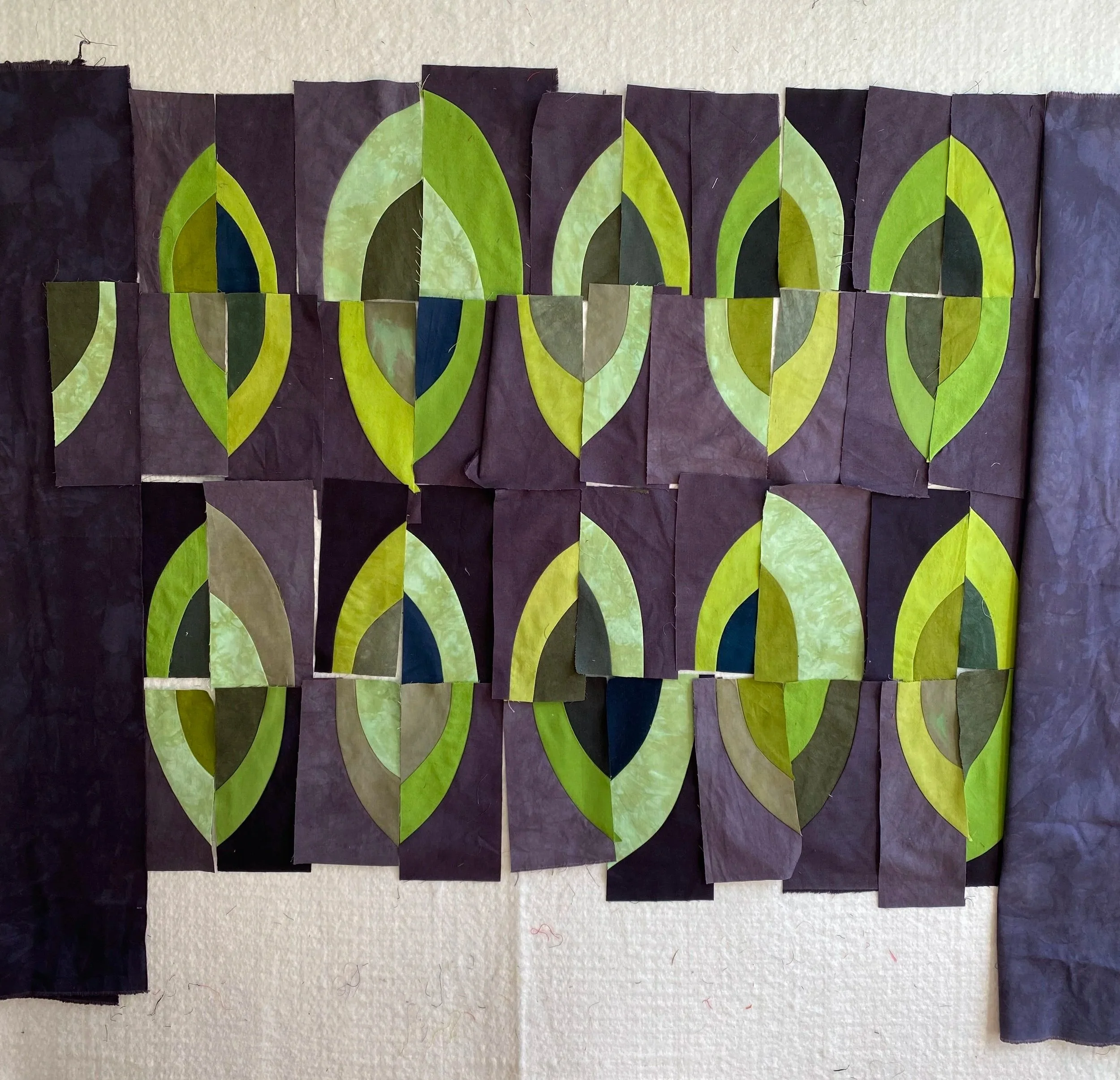
My quilt Forest Light is a good example of this approach. In that piece, I first pieced the central motifs, then built the background using a variety of my hand-dyed grey fabrics, allowing subtle shifts in value to add depth and movement.
Designing Forest Light

Forest Light, 2024
This post is Part I of a Color Stories series here on the blog. If you’re interested in a deeper, more comprehensive exploration of working with color in quilts, I also offer a lecture titled Color Stories: How to Use Color Effectively, available for guilds and groups.
More to come.